


Economic Summary
This week's economic data showed mixed results.
On the negative side:
-
The housing sector was clearly impacted by rising interest rates. The average 30-year mortgage rate rose from 6.30% to 6.43% last week. This resulted in mortgage applications falling 10.5%, led by a 14.6% decline in applications to refinance paired with a 5.8% decline in applications to purchase a house.
-
Inflation for businesses rose as import prices rose 1.3% year-over-year in February compared to 0.3% in January and export prices rose 3.5% compared to 2.6%. Another form of rising costs was the news that unit labor costs rose 4.4% in the 4th quarter compared to 1.0% in the 3rd quarter. Good for employees, not so good for business owners.
-
Initial jobless claims rose 5,000 to 210,000. That is still within the 200,000 to 250,000 range that has existed since 2023.
-
The S&P Global Service PMI fell from 51.7 in February to 51.1.
-
Consumer sentiment continued to deteriorate as the University of Michigan Consumer Sentiment Survey showed a decline in March from 56.6 in February to 53.3. The Current Conditions sub-index from 56.6 to 55.8. The Future Expectations sub index fell from 56.6 to 51.7.
On the positive side:
-
The manufacturing sector showed improvement. The S&P Global Manufacturing PMI index improved from 51.8 in February to 52.4. The Kansas City Federal Manufacturing index rose from 5 in January to 11 in February and the Richmond Federal Reserve Manufacturing index rose from -10 to 0.
-
Continuing claims for unemployment benefits fell 32,000 to 1,819.00.
-
The Richmond Federal Reserve Services index rose from -8 to +9.
Perspectives
Soundbite
Some people may argue that the housing affordability issue is simply a lack of supply. While housing supply is clearly a force that drives home prices, over the past decade, population growth also plays an important role. Using statistical analysis of the data shows that supply change plus population growth within a state account for 83% of the increase in home prices.
Although population and inventory change are the driving forces over the longer term, the forces are far more varied over short periods of time. These forces include government policy (regulations, zoning, permitting, etc.), inflation, interest rates, material and labor costs, existing homeowners locked into low mortgages and unwilling to sell, in-migration of people who sold their previous home for more than home prices in the new state, lack of land (lots) available, and investor activity.
Analysis
Let us start by examining the long-term results for population growth versus price growth. You can see from the graph below that there is a very clear pattern that as a state's population grows, home prices grow. What we see is that, over the past ten years, there has been a Sun Belt and Mountain West migration pattern. The two Sun Belt states in the top five were Florida and Tennessee while Idaho, Utah, and Montana were the Mountain West states that were in the top five.
Running regression analysis can help understand if population is really a force for home price growth or simply a coincidence. Since most of us are not statisticians who enjoy the technical numbers of regression analysis, I will try to keep the explanation as close to “plain English” as possible. What regression analysis provides us is a “confidence” score. By that I mean the r-squared results tell us that 54% of change in price is due to population growth. Note that even the states that had negative population growth had positive home price growth. The bottom five states for population growth still had home price growth and had 10-year home price growth of at least 35.2%. That is because population growth does not explain all the home price growth. Referring to the regression analysis results, the model projects that even if there was no growth in population, home prices should have risen 54.5% over the 10 years. That could be for a variety of reasons that will be discussed below. 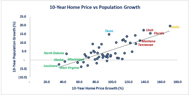
As discussed above, population is a significant force for home price growth over the past decade, but it was not the only reason. Let us examine two states that had similar 10-year population growth but far different home price growth. Texas is highlighted in blue and Idaho is highlighted in gold. Idaho was the #1 state for 10-year population growth at 19.5% and was also #1 for home price growth at 171%. Texas was #4 for 10-year population growth at 14.8% but it was only #21 for home price growth at 96.5%. Why would Texas see home price growth that was only 56% of Idaho's growth? Let us examine a second force that impacts home prices: inventory of homes available. As you can see from the graph below, there is an inverse relationship between inventory growth and home growth over the past 10 years. Intuitively that is logical since when there are fewer homes available, competition develops and prices rise. The fact that Idaho's housing inventory declined 45% while population grew 19.5% goes a long way toward explaining the size of the home price increase. The bigger inventory decline accelerated the home price increase started by the population growth. One analogy to explain this is that population growth is the kindling that starts a fire while inventory change is the fuel that determines how big the fire gets.
From a regression analysis standpoint, changes in inventory supply is the biggest driving force behind home price increase as it accounts for 61.2% of home price changes. For non-statisticians you may say “wait, 54% for population and 61% for inventory sums to more than 100%.” Unfortunately, you cannot just sum up the two because they overlap. Sticking with the fire example, consider two witnesses to a fire.
First witness: I saw a house burn to the ground.
Second witness: I saw a two-story house, where the fire started in the attic, burning to the ground.
Both witnesses are describing the same event but their stories overlap.
Statistics solve this by running regression analysis that incorporates both variables. This process strips out the overlap. For home prices, the combination of population and inventory change accounted for 82.8% of home price change over the past 10 years.
Like the populations story, you can see that even states with the slowest decline in inventory growth still had double digit home price growth. Examining the graph below reveals that not only did Idaho have the fastest home price growth, it also had the highest inventory decline. Put simply, the strong population growth started the home price “fire” for Idaho which rapidly consumed the available inventory. Idaho could not build new homes fast enough to keep up with demand and existing homes did not come onto the market fast enough. Texas is a far bigger state with more available land and Texas was aggressively building new home supply. As a result, inventory declined far less than Idaho.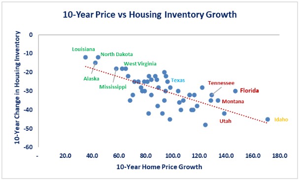
The 5-year picture is far more muddled. Population growth was not as strong of a force for home price growth as it was for the 10-year period. From a regression standpoint, population growth only explained 18% of the home price movement. That means that other forces were impacting home price movement. Part or all of this may be explained by the fact that the last five years suffered the side effects from the pandemic crisis. As we all know, the pandemic crisis spurred the advent of virtual meetings and work-from-home policies. As a result, it was not as important for someone to move to take on a job or advance their career. What we see from the graph is that even though Idaho led the nation for population growth again, it was not the leader for home price growth. This is most likely a sign of “growing pains.” By that I mean that the influx of people that had been occurring was now making housing unaffordable, so the pace of price increases slowed compared to the first five years of the decade. The other side of the coin is that states with limited population growth over the past five years were outpacing Idaho for home price growth. There are 10 states that had far slower population growth than Idaho but had faster home price growth. This could be the combination of limited supply of existing homes due to people working remotely rather than moving and the higher cost of new construction as the Federal Reserve started its interest rate increases near the beginning of this 5-year period. The basic message is that, over the past 5 years, population played a smaller role in home price increases.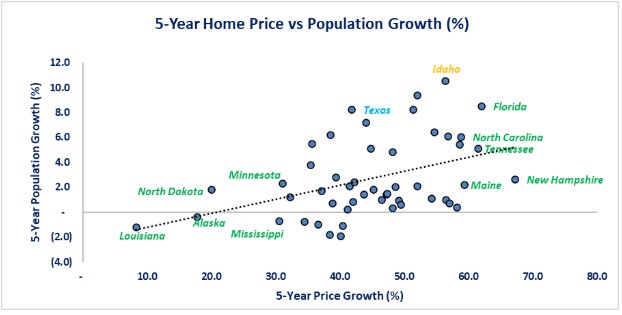
The housing inventory picture is even more muddled. Some of you may think the graph below looks like someone handed their child a pen and a blank sheet of paper and the child started randomly filling the paper with dots. The message from the graph is that all states experienced declining growth rates for inventory over the last 5 years, but like population growth, it did not show a clearly discernable link to home price growth. From a statistical standpoint, inventory change accounted for 35.1% of the change in home prices. When you combine population and inventory changes the percentage was 32.1%. This highlights that there were other forces in play the affected home prices. This could include forces like government policy (regulations, zoning, permitting, etc.), inflation, interest rates, material and labor costs, existing homeowners locked into low mortgages and unwilling to sell, in-migration of people who sold their previous home for more than home prices in the new state, lack of land (lots) available, and investor activity.
You can see the lack of linkage to inventory change by looking at New Hampshire and Louisiana. Both experienced a -18% decline in inventory growth and yet Louisiana's home price went up 8.3% while New Hampshire's rate went up 67.3%. Texas and Idaho continue to show divergence too, as both saw inventory fall 25% and yet Idaho's home prices increased 56.4% while Texas increased 41.8%. Part of the explanation for this divergence could be the income levels for the people moving into the states. The normal process (as shown in the 10-year data) is that prices go up when inventory declines. Even though the graph is scattered, that basic rule remained true for the 5-year period. How much prices went up may well have depended on the people buying the houses. Those with higher income may be willing to get into bidding wars and drive prices higher to get their dream home, while people with lower income may be less willing or unable to bid prices higher. This would limit the pace of home price increases. If we use the change in the median household income for a state as a proxy for the impact of people migrating to the state, we see that both Idaho and New Hampshire had a larger 5-year increase in income compared to Texas and Louisiana. That implies that New Hampshire and Idaho may have had more people with higher incomes migrating to their state compared to Louisiana and Texas. Higher incomes also mean the household could afford higher mortgage payments created from the rising interest rate environment that started in 2022, while lower income households could be shut out of homebuying. This would mean less demand in the lower income states once rates started rising and slow price increases. 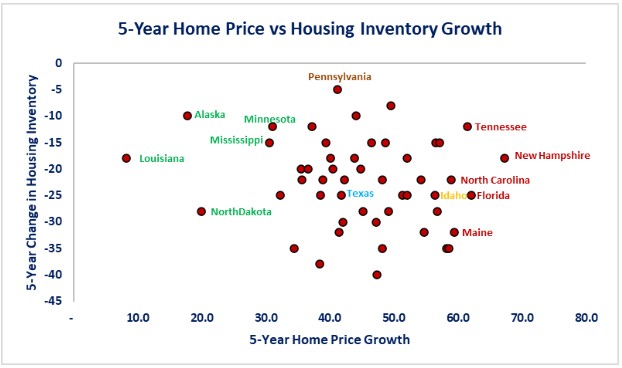
Over the last year, the population results flipped. Rather than showing home prices growing as population increases, the pattern showed declines. There are 8 states where 1-year population rose and home prices fell and there were 5 states where population fell and yet home prices grew. Even Idaho, with the fastest 1-year population growth ranked 33rd for home price growth. The overall regression model showed that population growth played a small role in home price changes at 12.4%.
This is not a case of the regression model being broken. It is more the result of the cumulative impact of the previous 9 years of activity. One year population growth does not always have an immediate impact on home prices. Instead, 1-year home prices are more influenced by interest rates and affordability issues. Idaho is the perfect example of this. After 9 years of strong population growth and housing inventory decline, home prices have become unaffordable to many of the population. To illustrate this point, Idaho ranked 49th for average weekly earnings in 2015 and 23rd for home prices. Now, it has improved 6 positions for average weekly earnings to 43rd but it has jumped 9 positions for home prices to 12th highest in the US. Wage growth has not kept up with home price growth, compounded by higher interest rates results in home price increases that have moderated compared to states with lower population growth.
As you can see from the chart, the top five states for 1-year population growth are all in the Northeast. This is the area constrained by land and lot supply while still having population growth (albeit slow growth).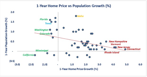
Examining the inventory story shows the 1-year growth patterns have returned from the “scatter plot” of the 5-year period and now display the negative relationship of the 10-year period. That means that it has returned to the overall pattern when inventory growth slows prices rise and when inventory growth increases, price growth slows or turns negative. Once again, the Northeast is the area where inventory growth was negative, and home prices increased the most. Looking at the Idaho/Texas comparison again shows that Texas (as well as Colorado) have ramped up their supply of housing inventory and have experienced small price declines. Idaho has seen solid growth in inventory levels over the past year, but it was not enough to prevent prices from continuing to rise. The encouraging news is that there are 9 states who have seen positive inventory growth and price declines.
Statistically, inventory accounted for 9.1% home price growth in the 1-year period. The combination of population and inventory growth accounted for 14.2% of home price growth. Over the 1-year period, home prices are being driven by other forces than population and inventory changes. The primary forces are most likely mortgage rates, affordability limits, inflation, and government policy. Examining the 1-year period gives a picture that the housing markets are possibly entering a phase of normalization.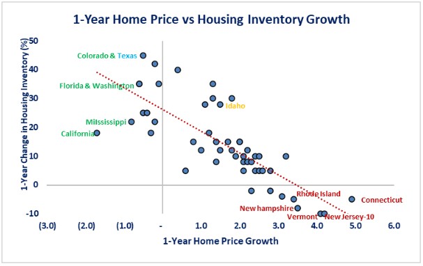
Conclusions
-
Housing inventory change has been the largest force that drove home prices over the last 10 years. Housing supply continues to be a major issue for most states.
-
Population change is a long-run signal for the direction of home prices but is not a short-term timing tool to decide when to buy or sell a house.
-
As time progresses (i.e., 5- and 10-year periods) population combined with inventory changes become increasingly predictive of home price changes in direction. This can be seen as the explanatory power increases from 14.2% to 32.1% to 82.8% over 1, 5 and 10 years.
-
Population growth explains the direction of home prices but is does not explain the magnitude. Inventory changes determine the magnitude.
-
The data points to the 1-year trend being more of a cyclical correction or the start of a market normalization, the 5-year trend was a distortion period, impacted from post pandemic influences and rising interest rates, while the 10-year trend is more of a structural trend.
-
Over the long term, population and housing inventory drives prices. You cannot have a healthy real estate market if population is shrinking. Population growth is the “kindling” that lights the “fire” of home price increases. Housing supply determines how big the “fire” becomes. Contrary to a normal fire, a lack of supply will create a bigger home price “fire.” Lack of supply is a critical part of today's housing affordability issue as lack of supply has increased the home price “fire.”

Steve is the Economist for Washington Trust Bank and holds a Chartered Financial Analyst® designation with over 40 years of economic and financial markets experience.
Throughout the Pacific Northwest, Steve is a well-known speaker on the economic conditions and the world financial markets. He also actively participates on committees within the bank to help design strategies and policies related to bank-owned investments.