


Economic Summary
Although inflation data dominated the news headlines, there were plenty of other economic data releases to consider.
Housing
Existing home sales improved to a 0.2% growth rate in April after falling 2.9% in March. The Mortgage Bankers Association reported a 1.7% increase in mortgage applications last week after a 4.4% decline the week before. Applications to buy a house rose 3.9% while applications to refinance fell 0.1%. The average 30-year mortgage rate was virtually unchanged at 6.46% compared to 6.45% the week before.
Inflation
The CPI rose 3.8% year-over-year in April while Core CPI rose 2.8%. Businesses most likely experienced a higher level of business pain than the consumer as the Producer Price Index (PPI) rose 6.0% and the Core PPI rose 5.2% year-over-year in April. For businesses that import, import prices rose 4.2% year-over-year in April. Businesses that export benefited from higher prices for the products as evidenced by the 8.8% increase in export prices.
Jobs
Initial jobless claims rose 12,000 last week to 211,000. This is still well within the 200,000 to 250,000 range that has existed since 2022. Continuing claims rose 24,000 to 1,782,000.
Manufacturing
The NY Federal Reserve's manufacturing activity index indicated solid improvement in manufacturing activity as the index rose from 11.0 in April to 19.6 in May. Industrial production also showed improvement as it rose from -0.3% in March to +0.7% in April. The manufacturing production sub-index rose from +0.1% to +0.6%.
Retail Sales
Retail sales rose 0.5% in April, driven by a 2.8% rise in gas prices and a 1.4% increase in Electronics & Appliance and a 1.4% increase in Sporting Goods. Sales at Furniture and Home Furnishing stores fell 2.0% while sales at Clothing stores fell 1.5%. Remember that retail sales data is not inflation adjusted, so the surge in sales at gas stations is most likely due to the rise in gas prices rather than a rise in the volume of gas purchased.
Real Earnings
The increase in inflation damaged the average worker's financial situation as their wage increases did not keep pace with price increases. Real average earnings fell 0.5% in April and fell 0.3% year-over-year. Real average weekly earnings fell 0.2% in April and 0.2% year-over-year.
Small Business Optimism
Optimism with small business owners improved marginally in April as the NFIB Small Business Optimism index rose from 95.8 in March to 95.9 in April. Survey respondents indicated a lack of qualified help was their biggest challenge. Taxes were second and inflation was third.
Perspectives
Soundbite
To use a beach analogy, just when you thought it was safe to go back in the water, another inflation wave is hitting. Although the headlines have focused on the surge in energy prices, the reality for the average consumer is they are seeing price increases of more than 3% for many of their “core” expenses. Based on a limited list of 30 categories that consumers most likely care about, 20 had year-over-year price increases above 3%, 14 had increases of 4% or more and 10 had increases of 5% or more as of 4/30/26. This is another factor in why consumer sentiment polls continue to show sentiment at or near record lows. To alter the famous Capital One slogan of “What's in Your Wallet?” the average consumer may be saying “what's left in my wallet?”
Analysis
Let us start by examining the inflation indices that the Federal Reserve monitors in determining whether their 2% inflation goal is being met. The Federal Reserve monitors CPI excluding food and energy as well as the Personal Consumption Expenditures (PCE) index, also excluding food and energy.
The graph below examines both indices as a consumer or business would examine their expense budget versus actual results. The gold line is the Federal Reserve's 2.0% target broken down into cumulative monthly targets. The red line is actual cumulative CPI through April. Note that this is not the media's report of year-over-year inflation or monthly inflation. This is the cumulative inflation that has occurred compared to the target level desired. The black line is the PCE index and it is only through March since those results will not be released by the Bureau of Economic Analysis until later this month. What you can see, if you were a business owner or simply monitoring your own expense budget, is that actual price increases are running far higher than the 2% target. In just four months, CPI has already risen by more than half of the year-end 2% target. If you were a business owner managing an expense budget, you would not be happy that you were so far off budget already. If you are a consumer managing your household expense budget, you would also not be happy if you saw this type of variance in your budget. It is probably safe to say that the Federal Reserve is not comfortable with these results. Remember, this graph shows “core” CPI which excludes food and energy, so it is not being directly influenced by the surge in energy prices that have occurred since the war with Iran started.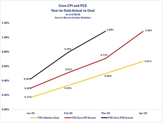
The average consumer would most likely laugh at tracking inflation indices that exclude food and energy since those are core expenses for them. Let us examine what is happening with inflation in those two categories.
Quick note:
For the remaining graphs, red bars identify categories where prices rose more than 5% year-over-year. Orange bars identify price increases between 4.0% and 4.9%, gold bars identify prices increases between 3.0% and 3.9%, yellow indicates increases between 2.0% and 2.9%, light green is 0 and 1.9%, and bright green identifies categories where prices fell.
The graph below examines food inflation. Recognize that this is not an exhaustive list of all food items. This is an attempt to capture the major categories that the average consumer may purchase. Your purchases may differ. Also, this is for food at home (i.e., groceries) not food away from home (restaurants, school cafeterias, etc.).
As you can see from the graph, three categories stand out for double digit year-over-year price increases: Coffee, Ground Beef, Fresh Vegetables. Most consumers are likely relieved to see that egg prices are dropping back to levels close to where they were before the Avian Flu hit and caused massive shortages and sky-high prices last year. Based off this list, the reality for the average consumer is that 10 of the 21 categories experienced year-over-year price increases of 3% or more and 7 out of the 10 had price increases of more than 5%. On the good news side, 7 out of the 21 categories had price increases of less than 1% and 4 of those 7 categories experienced price declines.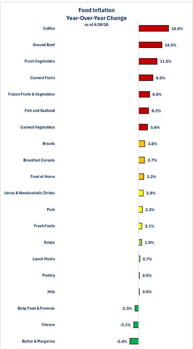
Let us now examine the energy categories. For any consumer who uses diesel or for the small minority who own a private plane, fuel oil prices are clearly showing the most impact from the surge in oil prices. Overall energy prices rose 17.9% year-over-year. Looking at gas price increases, you might think that you should switch from unleaded regular gas to unleaded premium gas since regular rose 29.2% while premium rose 24.7%. The problem with that line of thinking is that, even though the percentage increase was lower for premium versus regular, the actual price of premium is still higher than regular. For those trying to make ends meet, every penny per gallon matters. When it comes to heating your residence, those energy prices did not rise double digits. Electricity had the biggest increase between the three residential energy categories (Electricity, Natural Gas, and Propane, Kerosene & Firewood).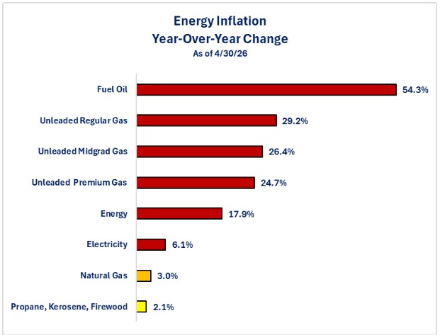
The last graph revisits the graph shown in the April newsletter covering inflation. Once again, it is not an exhaustive list, but it is also not a cherry-picked list (other than coffee). The list includes clothing, daycare, energy, food, medical, pet services, rent, subscription services, transportation, utilities, and vehicle maintenance. Not all may apply to you, and you may have other “core” expenses. The goal is to provide perspective on what the consumer may be experiencing versus what the headlines report.
What the graph below highlights is the fact that only 5 of the 30 categories had a year-over-year inflation rate at or below the Federal Reserve's 2.0% target. There are 20 of the 30 categories that experienced an inflation rate above 3.0% and 10 of those 20 categories had an inflation rate above 5.0%. This highlights the financial pain that many consumers, especially the lower income households, are experiencing as prices for items they need to buy or pay for continue to rise faster than 2.0%.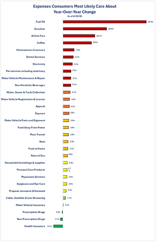
Disclosures

Steve is the Economist for Washington Trust Bank and holds a Chartered Financial Analyst® designation with over 40 years of economic and financial markets experience.
Throughout the Pacific Northwest, Steve is a well-known speaker on the economic conditions and the world financial markets. He also actively participates on committees within the bank to help design strategies and policies related to bank-owned investments.