



Understanding the K-Shaped Economy From an Income Perspective
There has been much discussion about the K-shaped economy, where parts of it are experiencing solid growth (the upper arm of the K) while other parts are experiencing struggles (the lower leg of the K). The most common discussions center on the income gap between the highest and lowest income earners. This month's Economic Perspectives examines the components of the Bureau of Economic Analysis's Personal Income data to help understand what is driving the income gap.
This month's newsletter is longer than normal given the number of income categories tracked by the Bureau of Economic Analysis (BEA). Because of this, I have changed the format for this month. For those that do not want to read through all of the detail, I am replacing the Soundbite and Closing Thoughts sections with a “Takeaways” section at the top to give you the summary of the newsletter.
For those who want the detail behind the macro, the remaining graphs and commentaries give you the detail.
Takeaways
- When it comes to discussing income inequality, the takeaway from the data is that the macro level picture of a growing income gap is not one trend, but several that are moving at different speeds and, in the case of the Rental Income, moving in different directions.
- Over the past 25 years (2000 through 2025), overall Household Income became more concentrated at the top. The share of the Household Income category held by the highest quintile (i.e., 80% to 100%) rose 4.7 percentage points, from 48.0% to 52.7% in 2025. The lowest quintile (i.e., 0-19%) fell 0.6 percentage points, from 5.8% to 5.2%.
- The sharpest growth in concentration was in the Proprietors' Income and Dividend Income categories. The top quintile's percentage of Proprietors' Income rose from 83.9% in 2000 to 87.9%, and the percentage of Dividend Income rose from 76.6% to 85.4%.
- For those focused on whether the upper income earners are paying their “fair share” of taxes, the percentage of taxes paid became more concentrated in the top quintile since 2000. The share of taxes paid by the top quintile rose from 73.6% to 76.9% while the share paid by the bottom quintile rose from 0.8% to 0.9%.
- Taxes moderated — but did not eliminate — the growing concentration of Household Income. Examining the Disposable Household Income category (income after taxes paid) shows a less concentrated picture compared to Household Income. For the top quintile, the percentage of Disposable Household Income rose 1.7 percentage points, from 48.0% to 49.7%. The percentage held by the lowest quintile remained unchanged at 5.9%. This is far better than the 4.7 percentage point top quintile growth in the pre-tax household income, but the reality remains that the concentration still grew.
- The outlier in the income picture is the Rental Income category. Rental Income became more broadly distributed between the quintiles. The top quintile experienced a decline in the percentage of Rental Income as its share fell 7.1 percentage points from 40.6% in 2000 to 31.2% in 2024. The percentage grew for the three quintiles outside of the bottom and top quintiles.
- From an economic perspective, it is important to avoid treating “income” as a single, homogeneous concept. Growth led by wages, small-scale rental income, or broadly available government benefits will have a different household impact than growth lead by dividends, interest, or highly concentrated business income. This highlights the K-shaped economy, as those who receive dividends, interest or business income on top of their salaries have fared better in the current elevated inflation environment compared to those who only have their wages.
Analysis
The Bureau of Economic Analysis breaks down Household Income into eight components:
- Wages and Salaries, Proprietors' Income (Business Owners), Interest Income, Dividend Income, Rental Income, Government Social Benefits, Net Transfer Receipts from Businesses, and Transfer Receipts from Nonprofit Institutions.
Total Household Income data is through 2025, but because of the time it takes to compile the data, the data for the eight income components is through 2024. This is because of the data collection process. The best example is the fact that the IRS is still receiving tax filings for 2025. The Census Bureau uses a nowcasting model to project total Household Income through 2025, but not for the sub-categories.
The data throughout this analysis measures the share of an income category that is accruing to each percentile, not the dollar amount of income. That means that a percentile group may have experienced a decreased share of an income category but did not experience a decrease in the actual income received. It means that they are receiving a smaller portion total income “pie” from the category.
Let us start by examining total household income. As you can see from the chart below, the gap between the bottom quintile and the top is immense and only grew wider over time. The growth in the top quintile's percentage of the Household Income category came at the expense of the other four quintiles. As the table shows, the fourth quintile (60% to 79%) experienced the biggest percentage point loss in share of the Household Income category. Although the bottom quintile experienced the smallest percentage point decrease, it represents a meaningful decrease relative to its already small percentage. Examining the data reveals that the pattern is gradual, suggesting a long-running structural shift toward the upper end of the distribution quintiles.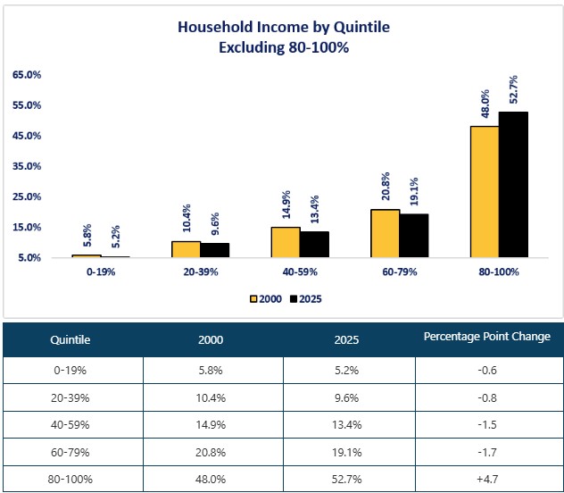
If the top quintile receives the lion's share of income, does it pay the lion's share of taxes? Let us now examine taxes paid to answer that question. What we can see from the chart is that our tax system creates a progressive tax burden with an increasing concentration of taxes paid at the upper quintiles. The share of taxes paid by the top quintile increased from 73.6% in 2000 to 76.9% in 2024. The bottom quintile's share rose from 0.8% to 0.9%. From a macro viewpoint, the top two quintiles accounted for 90.3% of taxes paid while the bottom two quintiles accounted for 3.7% as of the end of 2024.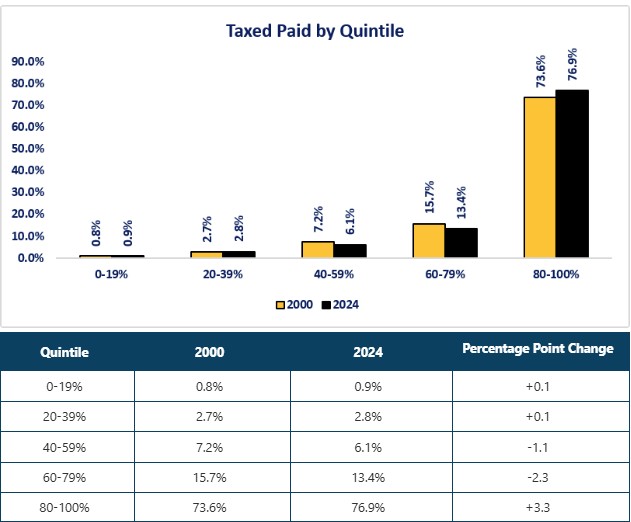
The next logical step is to examine the income gap after taxes. The graph and table below examine Household Disposable Income (i.e., income after taxes). What we can see from the chart and table is that the 4.7 percentage point gap between the lowest and highest quintiles for Household Income is reduced significantly because of the higher share of taxes paid by the top quintile. The gap after taxes has been reduced to 1.7 percentage points. The increase for the top quintile came at the expense of the third and fourth quintile (40% to 79%) as their share of the Household Disposable Income category fell. The two lowest quintiles actually gained slightly. This data highlights the equalizing effect of our tax system. However, the top quintile still gained in its share of Household Disposable Income. The tax system softened the increase in the income gap but did not eliminate or reverse it. 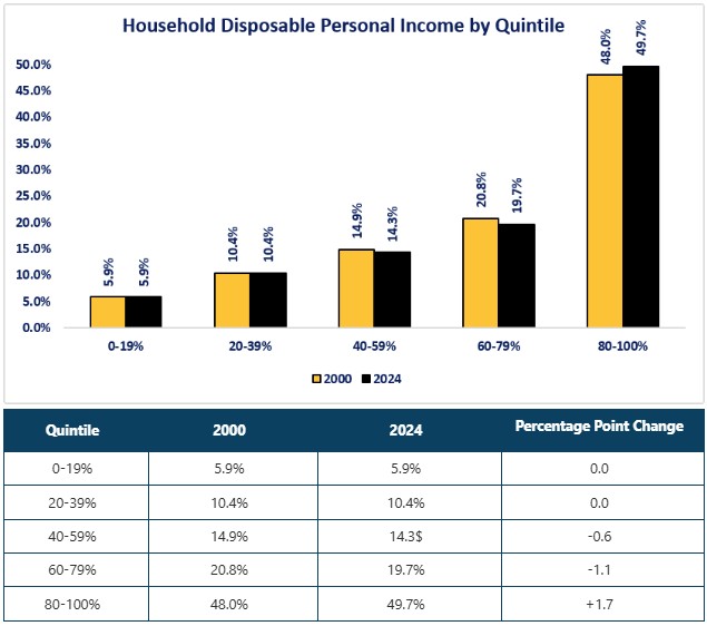
The rest of the analysis decomposes the Household Income data into the eight components that make up the total. Let us start by examining the most common source of income for the average American-Wages & Salaries. What the graph shows is that the share of the Wages & Salaries categories are similar to the Household Income category. Intuitively, this makes sense since it makes up 50% of Household Income. What the table highlights is the bottom two quintiles remained stable while the top quintile gained share over the third and fourth quintile. Since wages and salaries are the largest income source for most working households, the trend of increasing concentration at the upper quintile is central to the broader concentration of income trend.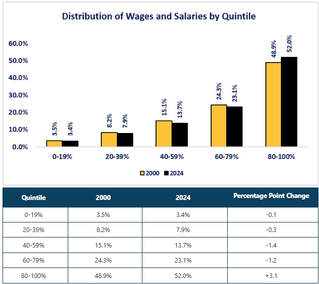
Proprietor's Income is the most concentrated of the eight income categories. The top quintile receives 87.9% of the Proprietor's Income category and grew by four percentage points since 2020. The bottom quintile grew by 0.4 percentage points, but that is meaningful since the percentage as of 2020 was 0.0%. What is hidden behind the quintile data is the fact that when you drill down further with the analysis, you discover that the 80% to 89% part of the top quintile dropped from 11.1% of the total to 5.8%. That means that the income gap for the Proprietor's Income category was highly concentrated in the 90% to 100% portion of the top quintile. It is important to remember again that this is measuring who got the income, not the dollar amount of the income. There is no message here that small businesses are wealthy. It is simply saying that whatever the size of proprietor's income, 20% of the people received 87.9% of that income. The simplest way to explain this concept is if you assume there a 100 small business owners and total proprietor's income was $100, 20 of the small business owners received $87.20 while the remaining business owners received the rest. 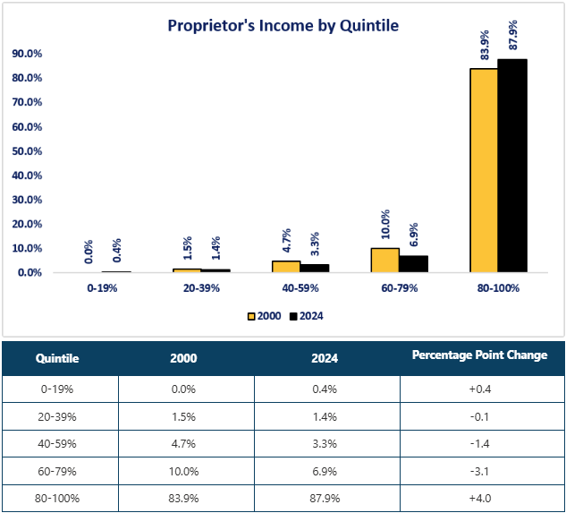
The Household Dividend Income category has the second highest concentration after Proprietor's Income, and the change in percentage was the biggest among all eight categories. The percentage of Household Dividend Income held by the top quintile grew 8.8 percentage points from 2000 to 2024. This makes sense because of the highly unequal ownership of corporate equities (individual securities, mutual funds and ETFs). Household Dividend Income is one of the clearest links between wealth concentration (the securities owned) and income concentration (the dividends paid).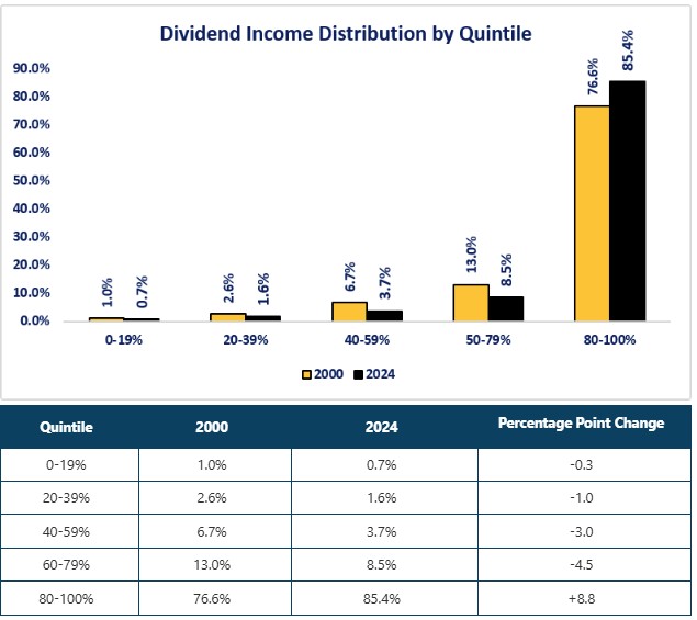
Household Interest Income is another category that links wealth concentration to income concentration, since the larger your holdings of interest-bearing assets, the higher the interest income paid.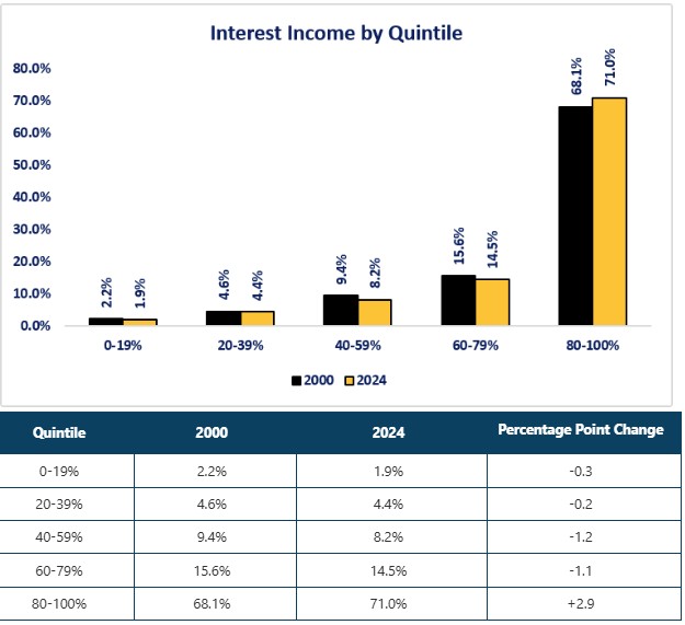
The Household Rental Income category may be the category that surprises most readers. The gap narrowed between the bottom and top quintiles, while the gap widened between the lowest quintile and the next three quintiles. Rental income appears to be the income category that is more accessible to middle-income and upper-middle-income households. Potentially, this could reflect a broader ownership of small rental properties. 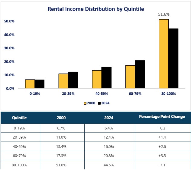
The interesting trend that we can observe from the graph below is that the concentration of income from the Government Social Benefits category within the lowest quintile has decreased. The percentage decreased from 20.7% to 16.6%. The two lowest quintiles experienced a decrease while the three remaining quintiles experienced increases. This does not mean that the lowest quintiles had benefits cut, or reduced their dependency on this source of income. In some cases that may be true, but it is more likely a reflection that many government benefits — especially Social Security and Medicare — are tied to age, work history, or program eligibility rather than income levels alone. As a result, an aging population can shift a larger share of benefits towards middle and upper quintiles who begin to receive these benefits.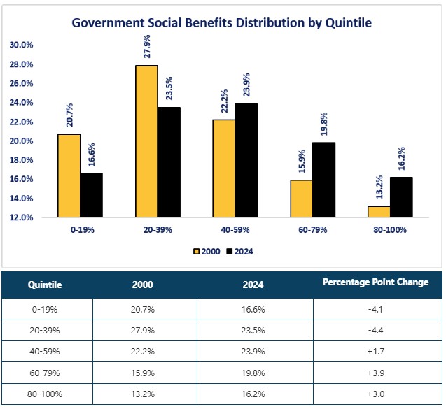
The Business Transfer Payments Category is a bit of an odd duck. This category is composed of payments received from businesses that are not wages, investment income, or payment for providing a service — primarily insurance settlements, legal or injury-related payments, corporate prizes, and certain compensation for losses. The concentration of this income in the top quintile may reflect that people in this quintile have the resources to engage experts to achieve the highest payouts.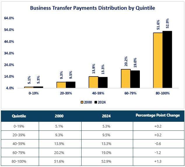
Although the individual results for 2000 and 2024 do not show it, the underlying data shows that Nonprofit Transfer income category is the most volatile of the eight income categories. Year-to-year variation is much greater than in the large income categories. The Nonprofit Transfer category is a progressive benefits category that helps — but does not solve — the income gap. As the graph and table show, the lowest quintile’s share of this income category grew 5.8 percentage points, while the top quintile fell 2.0 percentage points.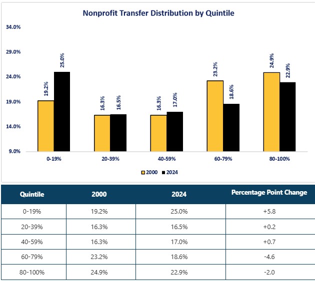
Disclosures

Steve is the Economist for Washington Trust Bank and holds a Chartered Financial Analyst® designation with over 40 years of economic and financial markets experience.
Throughout the Pacific Northwest, Steve is a well-known speaker on the economic conditions and the world financial markets. He also actively participates on committees within the bank to help design strategies and policies related to bank-owned investments.